Bayesian Testing Pitcher Performance
by Alex Nelson, 22 November 2017
We had a couple case studies for whether pitchers performed as expected, or worse than expected. There’s a method of testing performance which matches (roughly) one’s intuition, Bayesian inference.
The basic idea is the following: we have a pitcher of “unknown skill”. And by “skill”, I mean the ratio of hits + balls + walks to pitches. We know by the central limit theorem that it should be somewhere “near” the career average of these quantities, and if we’re clever we might have some bounds on where the pitcher’s skill should reasonably be.
Example 1: Ervin Santana
Bayesian inference treats the pitcher’s skill as a parameter, like the
bias of a coin, and from the pitcher’s career we can determine a
posterior distribution from the Jeffrey’s prior. For coin flips, with α
successes and β failures, we can estimate the coin’s bias using the
beta distribution,
specifically in the interval of the quantiles at 5%, ϴ0 = qbeta(0.05,
alpha, beta), and 95%, ϴ1 = qbeta(0.95, alpha, beta), with 90%
confidence (we can make it 95% by pushing the quantiles to 2.5% and
97.5%, respectively).
We end up with a plot that looks like the following:
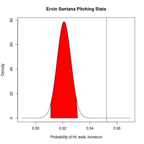
The region shaded in red is the 95% interval where Erin Santana’s “pitching ability” is estimated to lie. As we get more data, Bayesian methods can update the distribution, and the peak gets sharper (as one would expect intuitively). Note: this plot uses the data from our previous study and limits Santana’s career stats up to August 17th, 2015.
In the August 8, 2015 game between Minnesota vs Cleveland, where the score resulted in 4 Minnesota to 17 for Cleveland, the question is: why did this happen? We see that Santana is responsible for 10 hits, 2 walks, and 8 runs. The question we posed is: is this what we should have expected?
Intuition suggests no since Santana was the star pitcher for the Minnesota Twins. But how can we prove it? Well, we draw a horizontal blue line for Santana’s pitching ability at the game, then observe that approximately 99.999999945% of the density lies to the left of that line, which means either we’ve just witnessed a once-in-several-lifetimes-of-the-universe event (exciting!), or Santana was in a cold streak that day.
Example 2: Kevin Gausman
The August 7th, 2015 game between the Anaheim Angels and the Baltimore Orioles also was surprising, the final score: Angles 8, Orioles 4. (In fairness, the Orioles managed to get 13 hits, to the Angels’ 12 hits.) Was Gausman up to par or not?
We again use the beta distribution for Gausman’s career stats up to that point, and this gives us the posterior distribution plotted below with a 90% high density interval plotted in red. The stats for Gausman for the past several games is given by the blue vertical line in the plot:
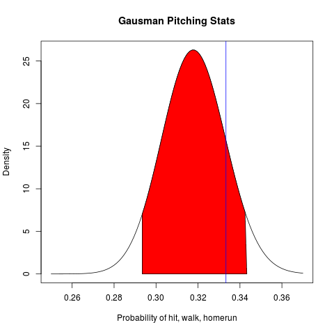
All things considered, Gausman was just having an off-day. It happens to the best of us, but now we have put an actual probability distribution to our intuition, and our expectations highlighted in red. The performance (or lack thereof) is indicated by a horizontal blue line, which lies within where one might intuitively expect Gausman to perform, albeit on the “worse end” of the range.